
Measured diagonally corner-to-corner.
Measured diagonally corner-to-corner.
Select two screens or enter custom display sizes to compare their screen dimensions visually with our Screen Size Comparison Tool. The tool draws both screens in proportion, either side by side or overlaid. It also lists their dimensions and the difference in display area.
About screen size comparison
Screen size is almost always given as the diagonal, the distance from one corner of the display to the opposite corner. A 15.6-inch laptop has a screen whose corner-to-corner measurement is 15.6 inches. The panel itself is a rectangle with its own width and height. Comparing two diagonals gives you a rough sense of which is bigger, but not by how much, or in which direction. A screen with a 10% longer diagonal doesn’t have 10% more area. This tool turns the two diagonals into two rectangles, so you compare shapes and scale instead of two numbers.
Table of Contents
How to use this tool
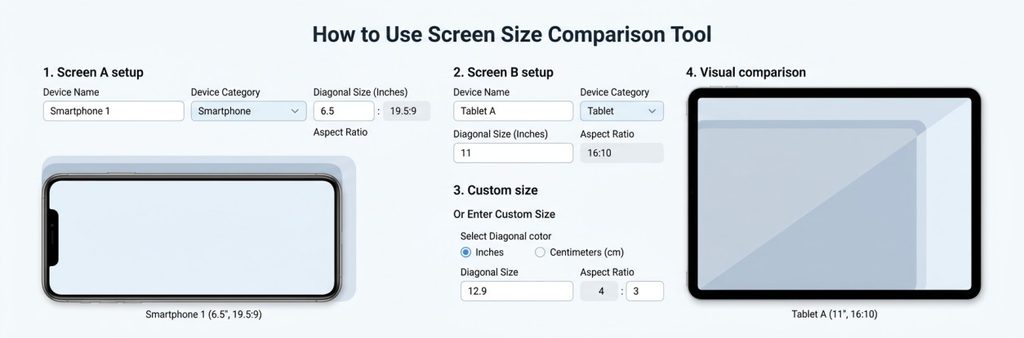
- Set up Screen A. Optionally type a device name so you can tell the two screens apart. Choose a device category, then select a predefined diagonal size and an aspect ratio.
- Set up Screen B. Fill in the same fields for the second screen.
- Use a custom size if you need one. If the size you want isn’t in the predefined list, choose the custom option. A custom size field appears, with a choice between inches and centimeters (cm). Enter the diagonal in whichever unit you have.
- Look at the visual comparison. Both screens are drawn to the same scale. You can view them side by side, which makes it easy to compare widths and heights, or as an overlay, which stacks one on top of the other so the extra width or height stands out.
- Read the numbers. Under the visual, the tool shows the dimensions and area for each screen. It also shows a display area comparison and the display area difference between the two.
Reading the visual comparison
Start with the overall footprint. Whichever rectangle is larger is the physically larger display. In the overlay view, the area where the larger screen sticks out past the smaller one is the extra display it provides.
Then look at each direction separately:
- Width: does the larger screen stick out at the sides?
- Height: does it stick out at the top and bottom?
- Proportions: if the two screens have different aspect ratios, one will look wider and flatter and the other squarer. Screens of the same diagonal can still look quite different.
The side-by-side view suits quick comparisons of width and height. The overlay is better when the two sizes are close, because a small margin around the edges is easier to see when the shapes are stacked.
The picture shows the display area at true relative scale. It isn’t a photo or a model of any specific product.
Aspect ratio and screen dimensions
Aspect ratio is the proportion of width to height. A 16:9 screen is 16 units wide for every 9 units tall. A 16:10 screen is a little taller for its width, and a 4:3 screen is more square.
The same diagonal gives different rectangles depending on the ratio. Here is a 14-inch screen at two common ratios:
| 14-inch screen | Width | Height | Area |
| 16:9 | 12.20 in | 6.86 in | 83.7 sq in |
| 16:10 | 11.87 in | 7.42 in | 88.1 sq in |
Same diagonal, but the 16:10 screen is narrower, taller, and has about 5% more area. This is why the tool asks for an aspect ratio for each screen. Set it correctly for each device, or the comparison won’t reflect the real panels.
For anyone who wants the math, width = diagonal × W ÷ √(W² + H²) and height = diagonal × H ÷ √(W² + H²), where W:H is the aspect ratio.
Predefined vs. custom sizes
Predefined sizes are the fastest option when you’re comparing common sizes, such as two laptop screens or two monitors. Select and go.
Custom sizes are for anything the list doesn’t include: a specific tablet, a monitor that doesn’t follow a common size, or a size you’ve only seen quoted in centimeters. Choose the custom option, pick inches or cm, and enter the diagonal. The tool handles the unit conversion, using 1 inch = 2.54 cm. The tool uses the exact U.S. standard of 1 inch = 2.54 cm (NIST’s official conversion table)
Examples
14-inch vs. 15.6-inch laptop. The diagonal differs by 1.6 inches, which sounds small. The screen area differs by about 24%, which is easier to appreciate visually.
15.6-inch vs. 17-inch laptop. Another common step up. The overlay shows how much extra width and height the larger panel adds.
24-inch vs. 27-inch monitor. A 3-inch difference in diagonal works out to about 27% more display area at the same aspect ratio.
27-inch vs. 32-inch monitor. Here the area difference is roughly 40%.
55-inch vs. 65-inch TV. Also close to 40% more area. On a screen this size, the extra width is easy to see in the side-by-side view.
Phone and tablet screens. If you enter a phone’s diagonal manually, you’re comparing screen sizes, not full phones. That’s still handy for seeing how a 6.1-inch and a 6.7-inch display differ in width and height.
Laptop screen size comparison
Laptop sizes are usually quoted as 13.3, 14, 15.6, or 17 inches, and it’s tempting to treat the diagonal as a measure of width. It isn’t. Two laptops with the same diagonal but different aspect ratios can have noticeably different widths and heights. A bigger screen also doesn’t make a better laptop. The tool shows how much display area you get and nothing else about the machine.
Phones, tablets, and TVs
The same principle applies to any display. Enter the diagonal and the aspect ratio, and the tool draws the resulting rectangle. This is a screen-size comparison, not a device comparison. It doesn’t look up specific phone models, and it doesn’t include the bezels or body. If you’re comparing an iPhone to another phone, look up each phone’s screen diagonal and aspect ratio and enter them as custom values.
Worked example: 14 inches vs. 15.6 inches
- Set Screen A to 14 inches at 16:9. Add “14-inch laptop” as the device name if you like.
- Set Screen B to 15.6 inches at 16:9.
- Switch between the side-by-side and overlay views. In the overlay, the 15.6-inch screen extends past the 14-inch one on every side.
- Compare the dimensions. About 12.20 × 6.86 in for Screen A and 13.60 × 7.65 in for Screen B.
- Check the area figures. Roughly 83.7 sq in vs. 104.0 sq in, a difference of about 20.2 sq in, or 24%.
The 1.6-inch diagonal gap becomes about 1.4 inches of extra width, 0.8 inches of extra height, and about a quarter more area. The example only shows how the numbers relate. It doesn’t say which size is right for anyone.
What the tool can and cannot tell you
It helps you see:
- Which screen is physically larger?
- Relative width and height
- Screen proportions
- The difference in display area
- The approximate scale of two screens compared with each other
It doesn’t tell you:
- Overall device dimensions, including bezels
- Stand dimensions or mount compatibility
- Whether something will fit a given space
- Weight
- Resolution, picture quality, or refresh rate
- Which device is better
How accurate is the comparison?
The visual is a proportional drawing, not a photograph. Its accuracy depends on what you enter. Give it the right diagonal, unit, and aspect ratio, and it draws the correct relative sizes.
Three things affect the result:
- The diagonal you choose. Manufacturers often round advertised sizes, so the true diagonal may differ slightly.
- The aspect ratio. A wrong ratio produces the wrong width and height.
- Unit conversion. If you enter centimeters, the tool converts them, so the comparison is unaffected as long as the number is correct.
The tool shows screen scale. It doesn’t represent exact device outlines, and it isn’t meant to be used for precise engineering measurements.
Common mistakes
- Treating the diagonal as the width. It’s always longer than both the width and the height.
- Ignoring aspect ratio. Two screens with the same diagonal can have different widths, heights, and areas.
- Confusing screen size with device size. The screen is only the display area, not the whole body.
- Assuming the visual proves fit. A screen comparison can’t tell you whether a monitor fits on your desk.
- Comparing diagonals as if they were areas. A 10% longer diagonal is roughly 21% more area.
FAQ
What is a screen size comparison?
It’s a side-by-side or overlaid look at two screens at the same scale, so you can see the differences in width, height, and area.
How is screen size measured?
Diagonally, from one corner of the display to the opposite corner. The bezel isn’t included.
Does screen size mean screen width?
No. The diagonal is longer than the width. A 15.6-inch screen is about 13.6 inches wide at 16:9.
How do I compare two screen sizes?
Choose a size for Screen A and one for Screen B, then view them side by side or overlaid and check the dimensions and area difference.
Why do two screens with the same diagonal look different?
Because their aspect ratios differ. A 16:10 screen is narrower and taller than a 16:9 screen with the same diagonal.
What’s the difference between screen size and device size?
Screen size is the display alone. Device size includes bezels, frame, thickness, and any stand, so it’s always larger.
Related tools
If you want to look at specific types of displays in more detail, try the TV Size Comparison tool, the Monitor Size Comparison tool, or the Curved Monitor Size Visualizer tool.